Big Ideas, Real Impact.
〰️
Big Ideas, Real Impact. 〰️
Driven by curiosity and built on purpose, this is where bold thinking meets thoughtful execution. Let’s create something meaningful together.
My role: Sole designer, end-to-end. I owned the research, design, and developer handoff. I partnered closely with engineering, product, and two SMEs who knew EDI deeply.
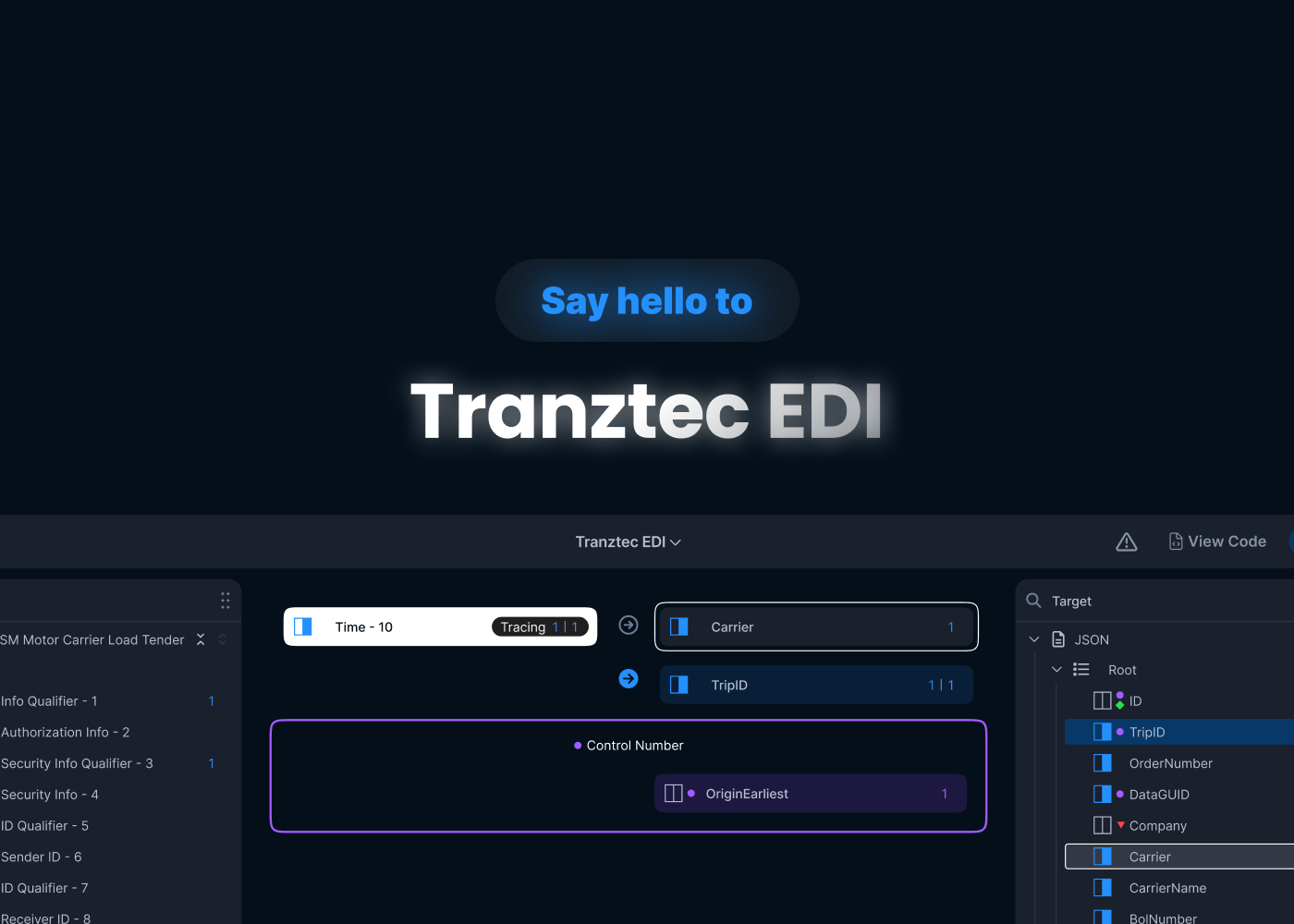
Tranztec EDI is an internal tool used to map data between different formats — taking an X12 EDI file from a trading partner and translating it into something the company's systems can actually use. It's not glamorous work, but it's the kind of plumbing that keeps logistics moving.
The tool worked. Users could get their job done with it. But it was painful, and the team knew it. I was brought on as the sole designer to fix and reorganize the interface.
The starting point
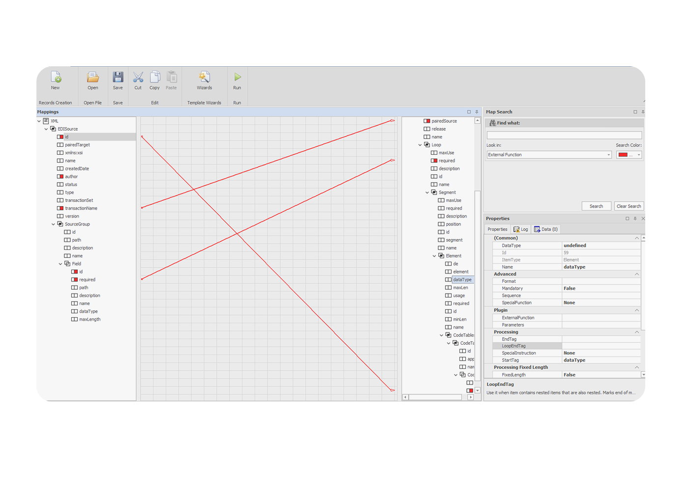
Before getting into what was wrong, here's what the tool looked like.
A top toolbar with file actions. Two tree panels in the middle, source on the left, target on the right, listing every field in the EDI document. A canvas in between, where lines were supposed to show connections. A search panel and properties panel are stacked on the right side.
The bones were reasonable. Source and target trees made sense. Properties had a home. Search existed. The pieces of an EDI mapping tool were all there.
Source and Target
The two side panels were where users actually mapped data, and they were the strongest part of the existing tool. But they had gaps. Variable mappings, connections governed by conditional logic, weren't visualized at all. And mapped fields lit up red, which collided with the error color. Mapped and broken looked the same.
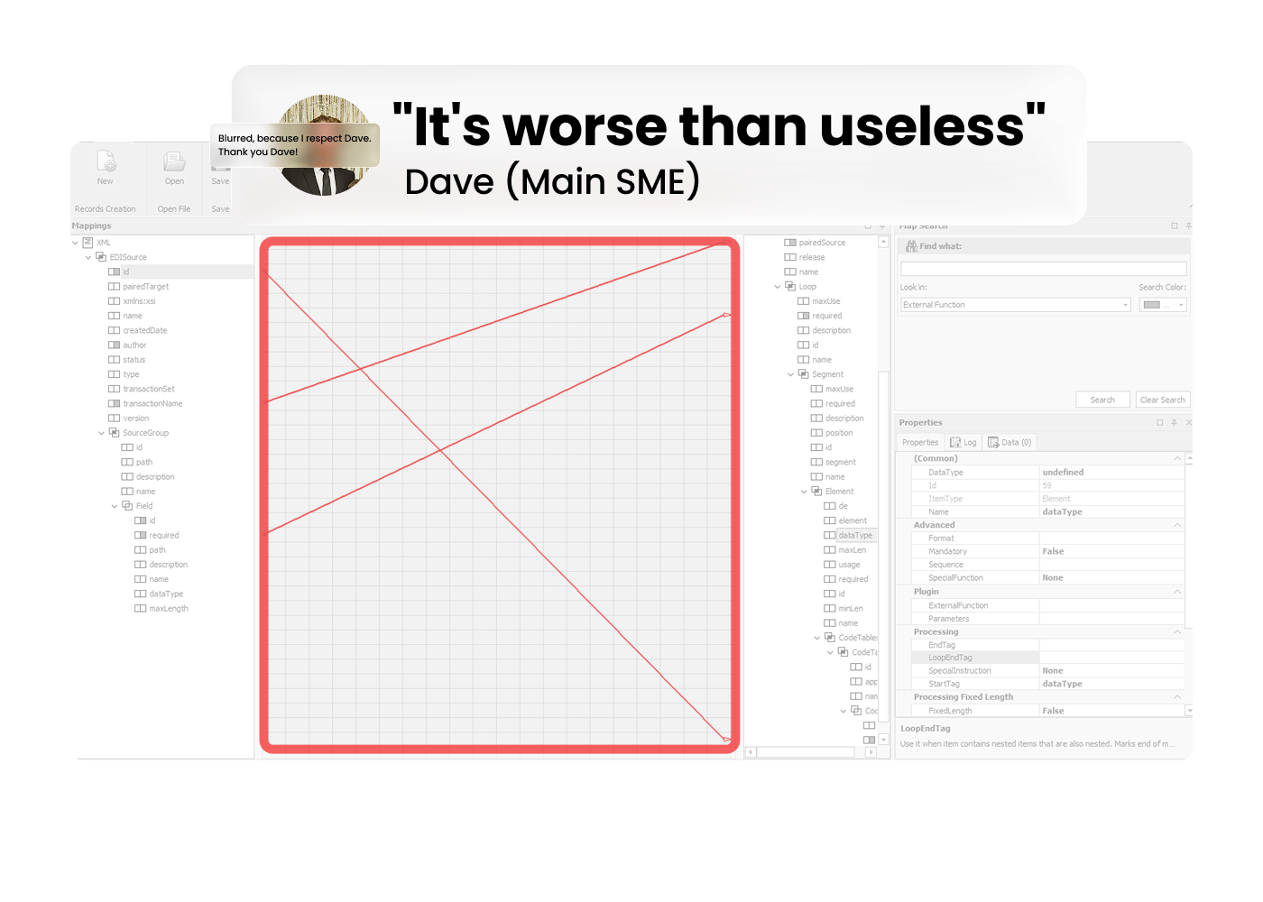
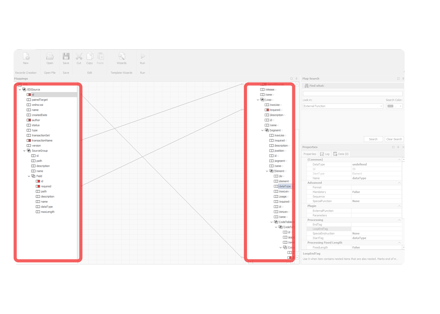
"Worse than useless"
When I asked Dave, the SME I met with weekly, what he thought of the center of the screen.
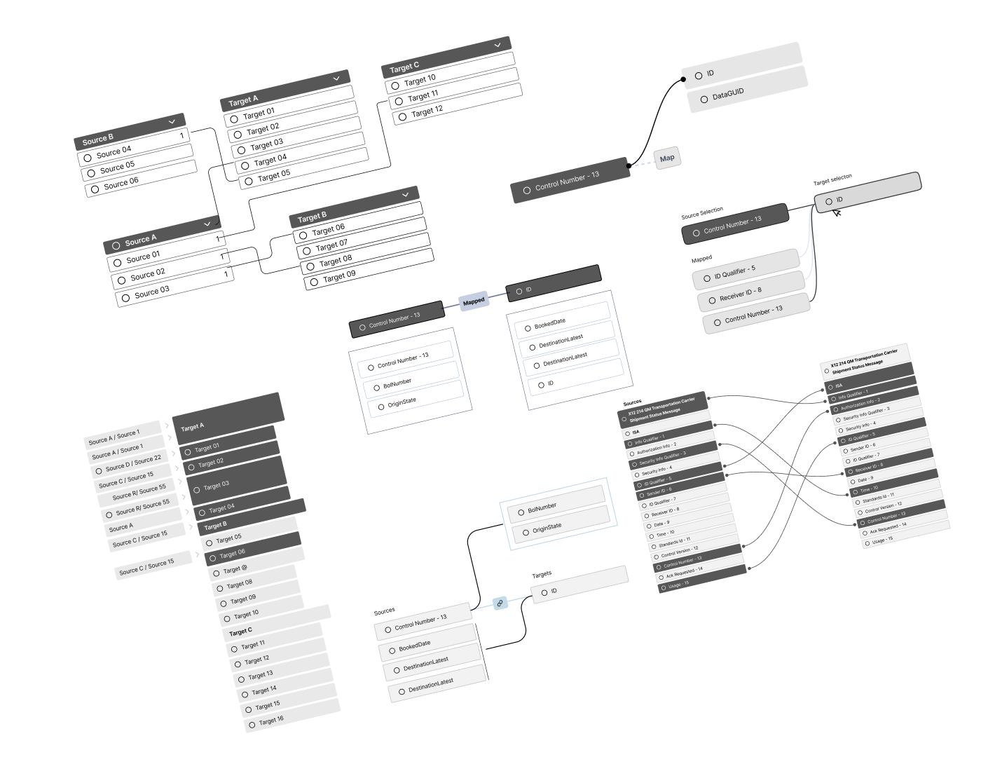
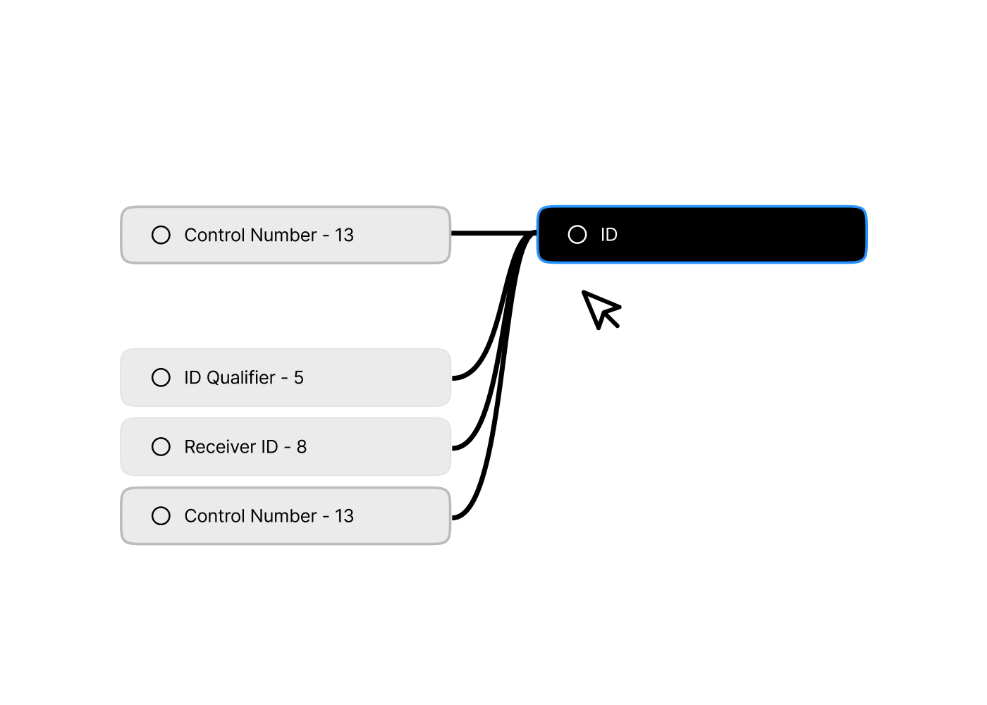
The center of the screen was supposed to show connection lines between mapped fields, source on the left, target on the right, lines drawn between them. In theory, this would give users a visual map of what was connected to what.
In practice, lines were only rendered when both endpoints were scrolled into view at the same time. Which, in any real EDI map, almost never happened. So users would see a few stray lines crossing the canvas, no clear sense of what they meant, and learn pretty quickly to ignore the entire middle of the screen.
That's the "worse than useless" part. The canvas wasn't just empty real estate, it was actively misleading, occupying the most prominent area of the screen while delivering nothing.
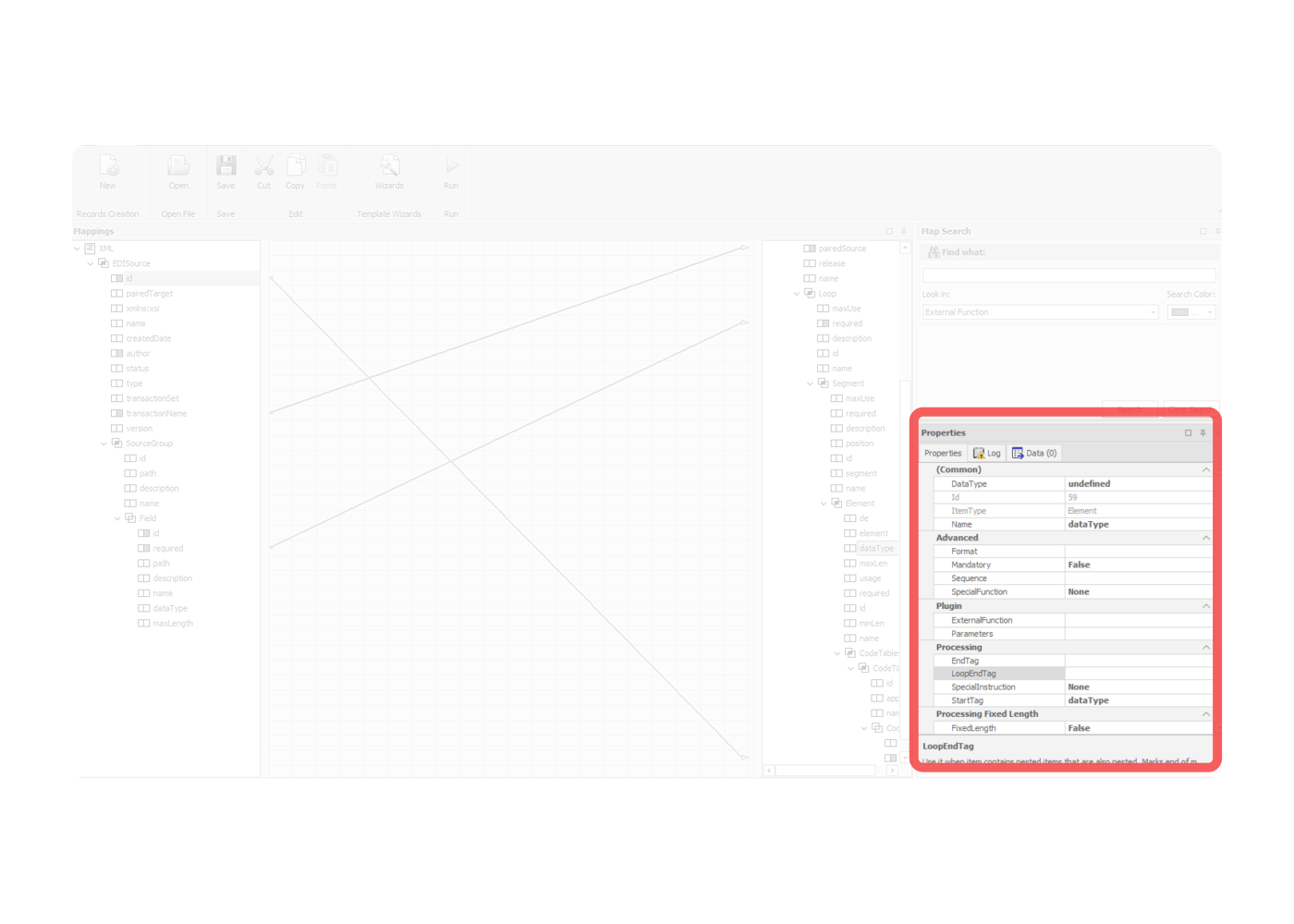
Properties panel
Every possible property field was visible, whether it was active or not. Users couldn't tell at a glance what was actually configured on a given field versus what was just sitting there empty. The connection between editing a property and seeing its effect on the element wasn't clear either.
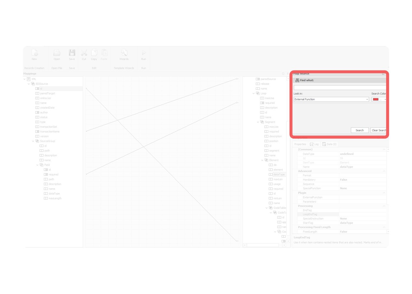
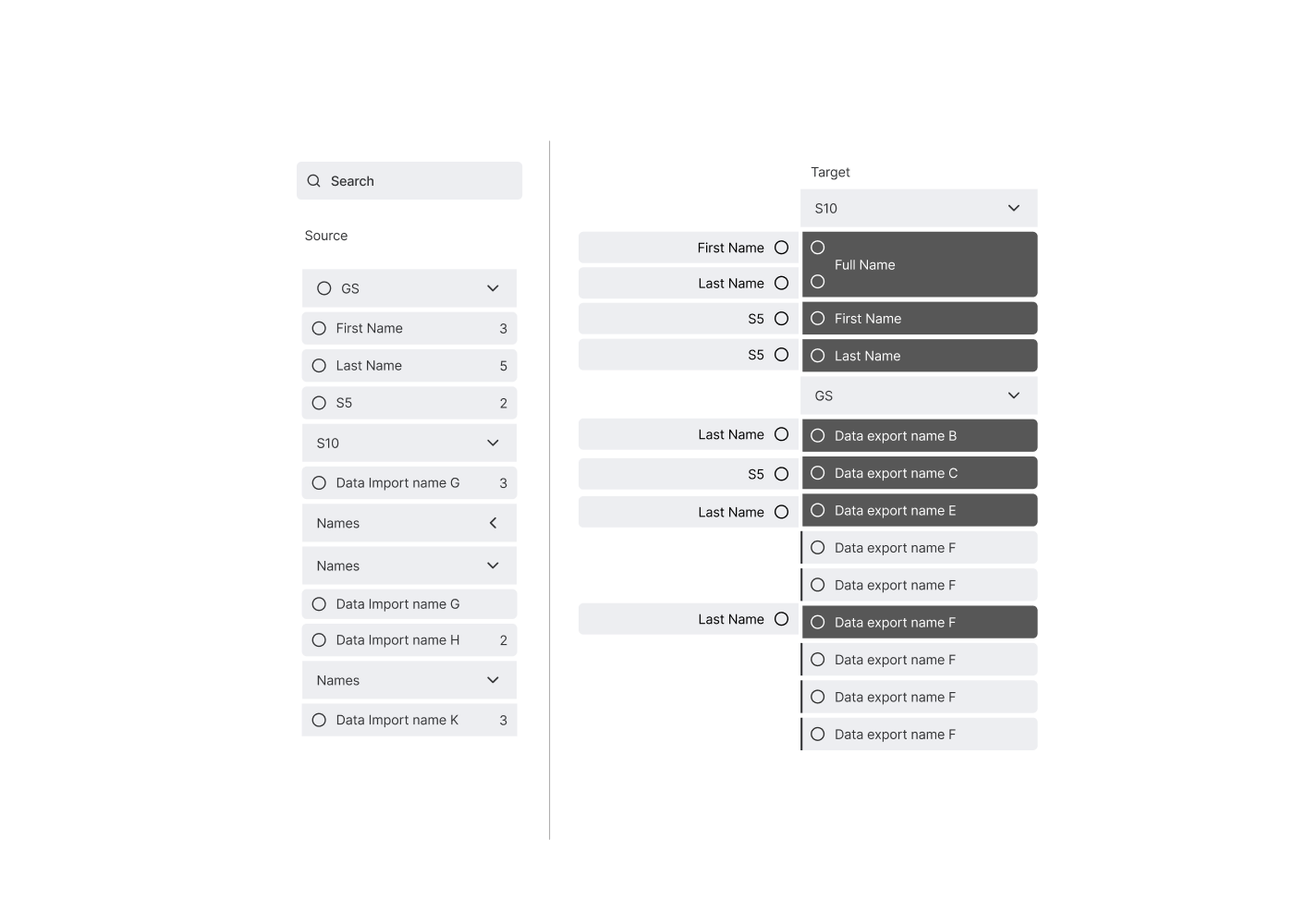
Search Panel
Search lived alone in the corner. The search panel was disconnected from the trees where results would appear. Users had to mentally bridge between the search input and the place they were actually looking. The panel even had a "Search Color" picker, which gives you a sense of how the feature had grown over time — bolted on rather than designed in.
The constraint
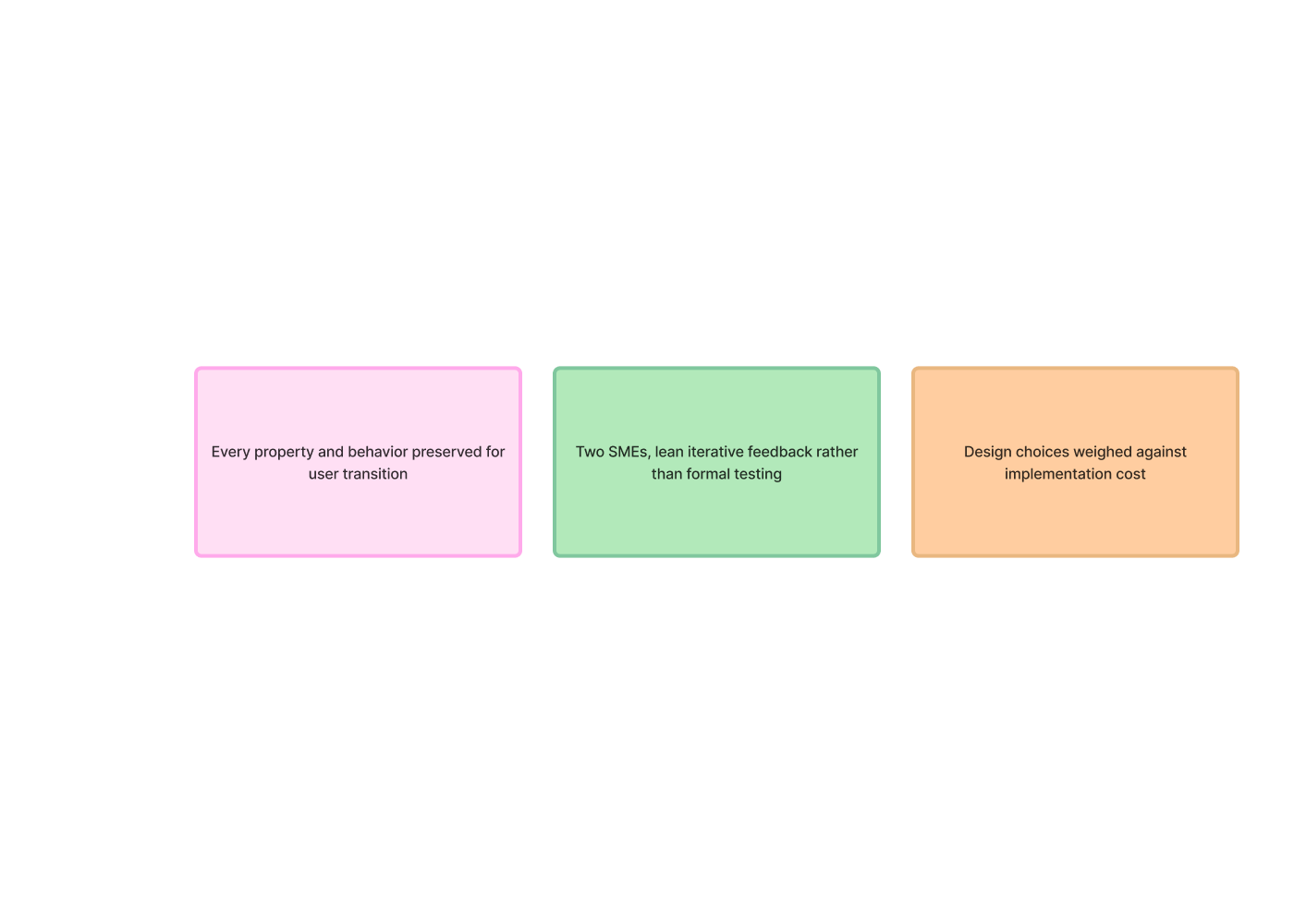
Before I could redesign anything, leadership gave me a hard rule: preserve every field, every property, every behavior. Existing users needed to be able to transition smoothly. The redesign was a reorganization, not a rebuild.
This shaped everything. I couldn't simplify by removing functionality. I couldn't introduce new metaphors that broke muscle memory. The job was to take everything that already existed and put it where it should have been all along.
How I worked
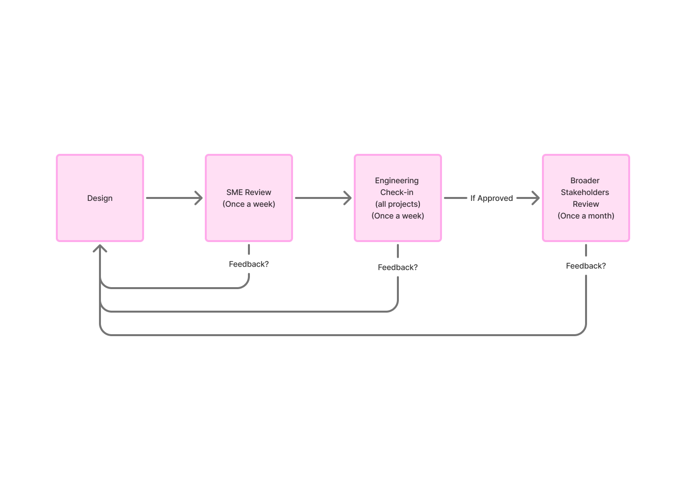
The feedback loop ran like this: I'd design, share with Dave for SME feedback, refine, present to a broader stakeholder group monthly, refine again, and check in with engineering throughout. Designs that survived all four touchpoints made it into the build.
Research was lean by necessity — only two people in the company had deep EDI expertise. I worked with both, weekly with Dave and roughly monthly with the senior stakeholder. Feedback was preference-based and iterative rather than formal usability testing. When alternatives came up, I'd present them side by side and gather reactions.
It wasn't a big team. But the cadence was consistent, and the feedback was direct.
the bucket idea
The first direction came out of brainstorming with Dave and a competitive review of other data-mapping tools. What if, instead of lines, we treated targets as buckets that source fields got dropped into? As more sources connected to a target, the bucket would expand to hold them.
It was visually concrete. The mental model — "I'm putting this source into that target" — matched how some users described their work. And it solved the spaghetti problem entirely by reframing connections as containment.
But broader stakeholder review pushed back. The other SME and stakeholders thought the buckets would get too bloated as more sources stacked into a single target — heavily-mapped fields would become unwieldy blocks of stacked items. They preferred an alternative direction: keep lines, but make them work this time. So I moved on.
contextual lines, then icons
The second direction kept lines but changed how they worked. Instead of trying to render every connection across the whole canvas, the workspace would only show the relationships of one selected element at a time. Pick a source field, see its mappings. Pick a different field, the workspace updates. This was the version that almost shipped.
This became the approved direction from the broader stakeholders.
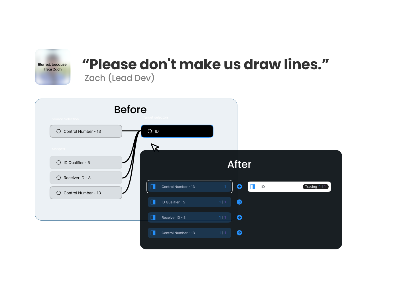
Then engineering looked at it.
Lines, it turned out, would mean building a new canvas-rendering layer from scratch. Icons could reuse existing tree-component infrastructure and ship in a fraction of the time. Zach (Engineering) made the case, and it was a good one. The user needs to know at a glance what was connected and how it could be met without lines. The visual mechanism wasn't sacred; the underlying clarity was.
So lines became icons. Badge counts carried the connection numbers. Colored indicators carried the connection types. And the workspace stopped trying to render lines it didn't need to render.
Was I a little sad about losing lines? Sure. Are icons probably the better answer at this scale anyway? Almost certainly.