
Fuzion
Ai-Assisted PlatformSole designer · Tranztec · 2025–2026
The mandate
Tranztec's existing integration product worked, but it was slow to use. When a customer wanted to connect a new system to the platform, an implementer on our team would hand-code the integration, mapping fields between the customer's source schema and ours, writing transformation logic, handling edge cases. A typical integration took over a week. Some took longer.
Leadership's brief was direct: bring implementation time down. Way down.
The bet was that an AI-assisted approach could collapse most of the hand-coding into natural-language instructions. Instead of an implementer reading two schemas and writing transformation code field-by-field, they'd describe what they wanted, and the AI would do the work. The implementer would review, adjust, and ship.
What we considered before committing
The AI mapper wasn't the only direction we explored. The team sketched two other approaches.
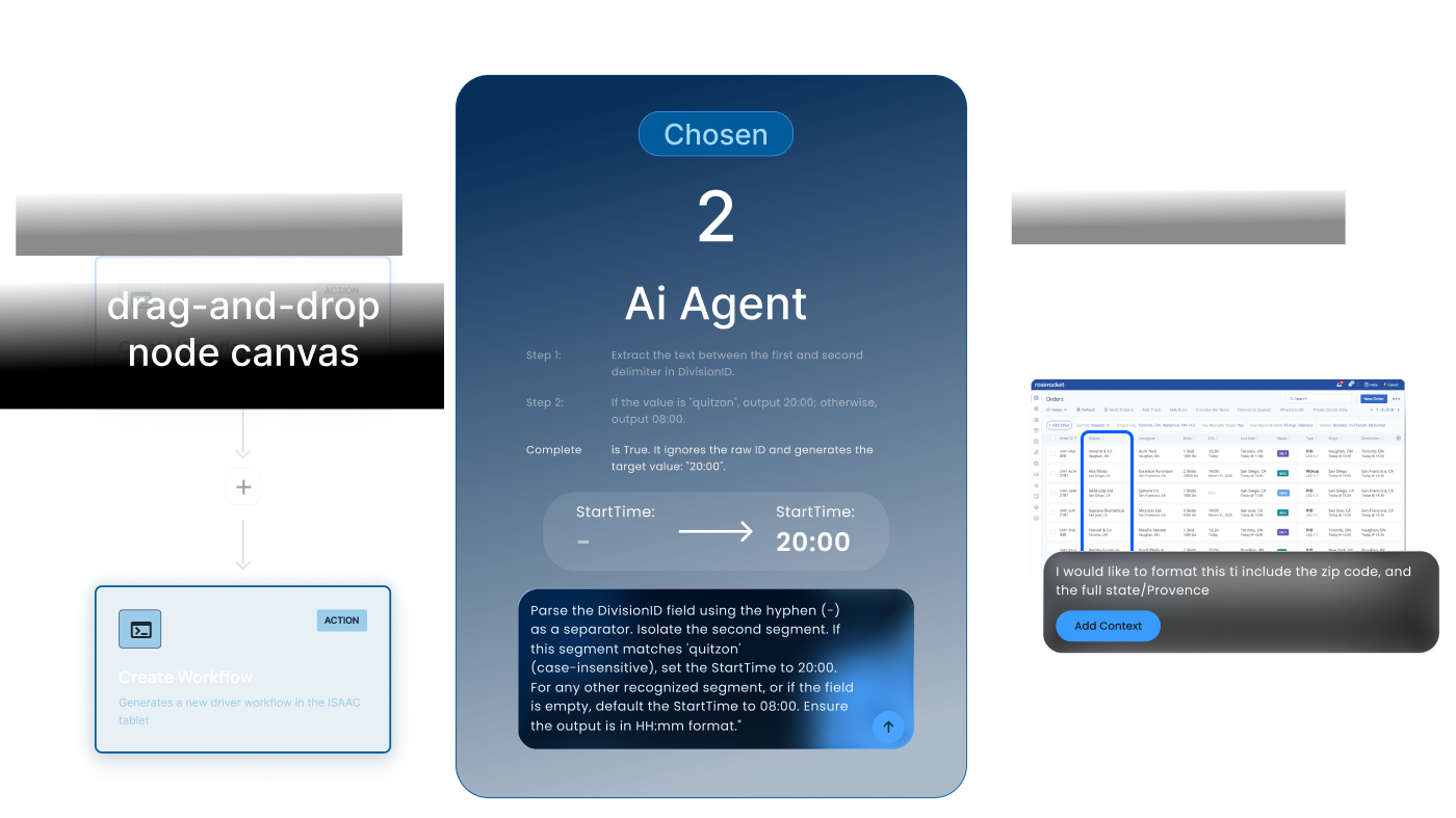
A drag-and-drop node canvas, Zapier-style. Workflows built from connected nodes (trigger, action, transform, output). Visually appealing and familiar to anyone who's used Zapier or n8n. The problem: it didn't really collapse the work. A complex transformation might require thirty nodes, and connecting them is its own kind of labor. We'd be replacing code with a visual representation of code. The implementer's time savings wasn't obvious.
The AI mapper. Natural language in, mapping out. Less to teach. The implementer describes the change in the way they'd describe it to a coworker, and the AI executes.
The AI mapper prototyped faster. A working version was getting positive reactions from internal testers within weeks. The node canvas would have needed a substantial prototype investment before we could even evaluate it. Given the time pressure on the project, we committed to the AI mapper.
AI Markup. Instead of editing source and target schemas (abstract field lists), the user would mark up a representation of the destination system they already know, point at where they want a change, type what they want, and let the AI figure out which fields to modify. The hypothesis was that pointing-and-annotating would be faster than describing-and-naming, especially for implementers who know their TMS visually but don't know every field name in the API. Promising idea, but not workable with the resources we had. Marking up a third-party system meaningfully would require building a visual representation for every customer's destination system (TMS, ERP, WMS), and that wasn't realistic for an MVP. We set it aside.
Chosen Direction
The AI mapper required far less resources to get a working version that was already receiving positive reactions from internal testers in its earliest versions. The node canvas would have needed a substantial prototype investment before we could even evaluate it. AI Markup needed even more upstream work to be testable at all. Given the time pressure on the project, we committed to the AI mapper.
How data flows
The data model treats each connection as having three layers: data coming in from the external system, data living on the platform, and data going out to the external system. The AI mapper edits the transformation logic at the boundaries, incoming and outgoing, per data type.
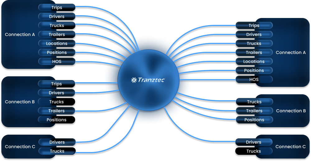
Each connection sends and receives a different subset of data types. Not every external system supports every direction. Some can send trips but can't receive them, some support full bidirectional sync, and some are read-only sources. The platform configuration mirrors what each connected system actually allows.
Inside a single connection, the user can see the rules currently transforming each data type in each direction.
The AI mapper is the design centerpiece, and the feature the entire product's value proposition depends on.
The workflow: a user is inside a specific connection. They pick a data type (Driver, Trip, Order, Truck, Location, etc.) and a direction. They see two schema panels, source on the left and target on the right, with all fields and current values, fully searchable. In the middle, they type natural-language instructions. The AI proposes changes, explains what it did, and the user reviews.
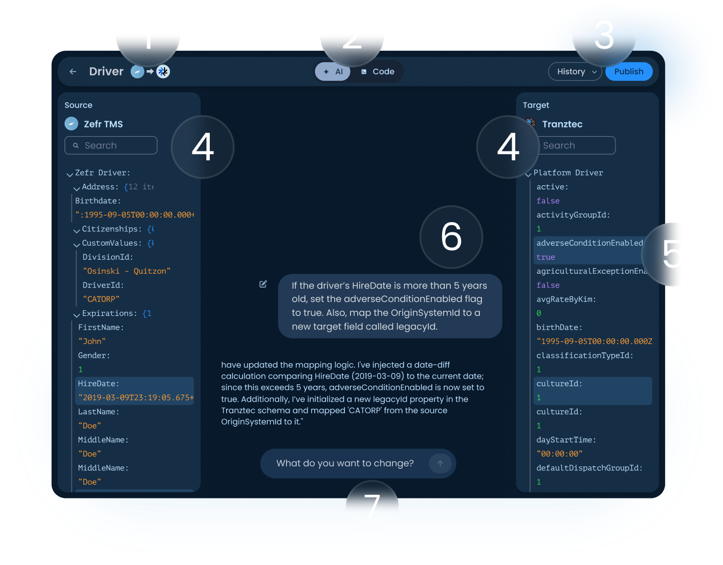
1. Header.: Shows the data type being edited and the direction of flow (source → target). The user always knows which mapping they're working on and which way the data is moving.
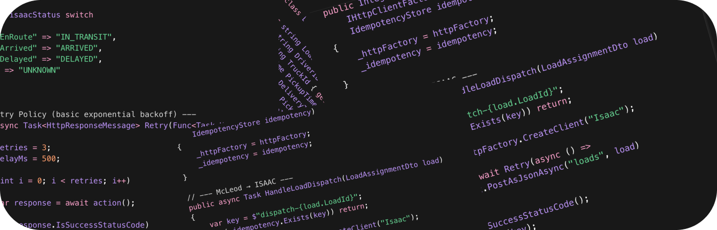
2. AI / Code toggle: Switches between the natural-language interface and the underlying code the AI is generating. Implementers — the people who used to write this code by hand, can drop into code mode at any point to verify or hand-edit. The AI didn't replace their expertise; it augmented it.
3. History and Publish. Changes are non-destructive until Publish. Every published version is saved and can be reverted from the History menu. When the user clicks Publish, the AI pre-drafts a changelog summarizing what was modified, and the user can accept it or write their own. This pattern is borrowed from version control, and it answers the most common anxiety AI tools create: what just changed, and can I undo it?
4. Source and target schema panels. All fields and current values, fully searchable. The source is what's coming from the external system; the target is what the platform will store (or send back out, depending on direction).
5. Highlighted fields. When the AI makes a change, the affected fields get highlighted in the target panel and source panels. The user can see exactly what moved without having to scan the whole schema.
6. AI conversation. Shows the user's instruction and the AI's response. The response names every field it touched and identifies which panel that field lives in. A typical response reads: "I've injected a date-diff calculation comparing HireDate (2019-03-09) to the current date; since this exceeds 5 years, adverseConditionEnabled is now set to true. Additionally, I've initialized a new legacyId property in the Tranztec schema and mapped 'CATORP' from the source OriginSystemId to it." The user can trace each change to a specific place in the UI.
Getting the AI to talk this way was a research project of its own. I tested prompt variations against the same set of mapping tasks, watching for clarity, conciseness, and what I came to call "receipts," the AI showing its work in a way users could verify. The final system prompt instructs the AI to name every field it changes, identify the panel each field lives in, ask clarifying questions when the user's request is ambiguous, and never make silent assumptions. None of that is the LLM's default behavior. It had to be engineered in.
7. Input field. Where the user types the next instruction. The session is stateless. Each opening of the mapper starts a fresh conversation. The version history covers continuity across sessions, but within a single session the user is talking to the AI about the current state of the mapping, not building up dialogue context. This was a deliberate constraint. Long conversations drift, and the cost of a drifted AI in a transformation context is real (mismapped fields can corrupt data downstream). Stateless sessions kept the AI grounded in what was on screen.
What I built
Fuzion is a workspace for managing integrations between a customer's external systems (TMS, telematics, ERPs) and the Tranztec platform. The product has six main surfaces: a Home dashboard for the workspace, a Data view showing every record currently living on the platform, Logs with structured detail panels and AI-generated summaries, Users for workspace management, Connections with their own data flow configuration and AI mapper per connection, and an Onboarding flow for first-run setup.
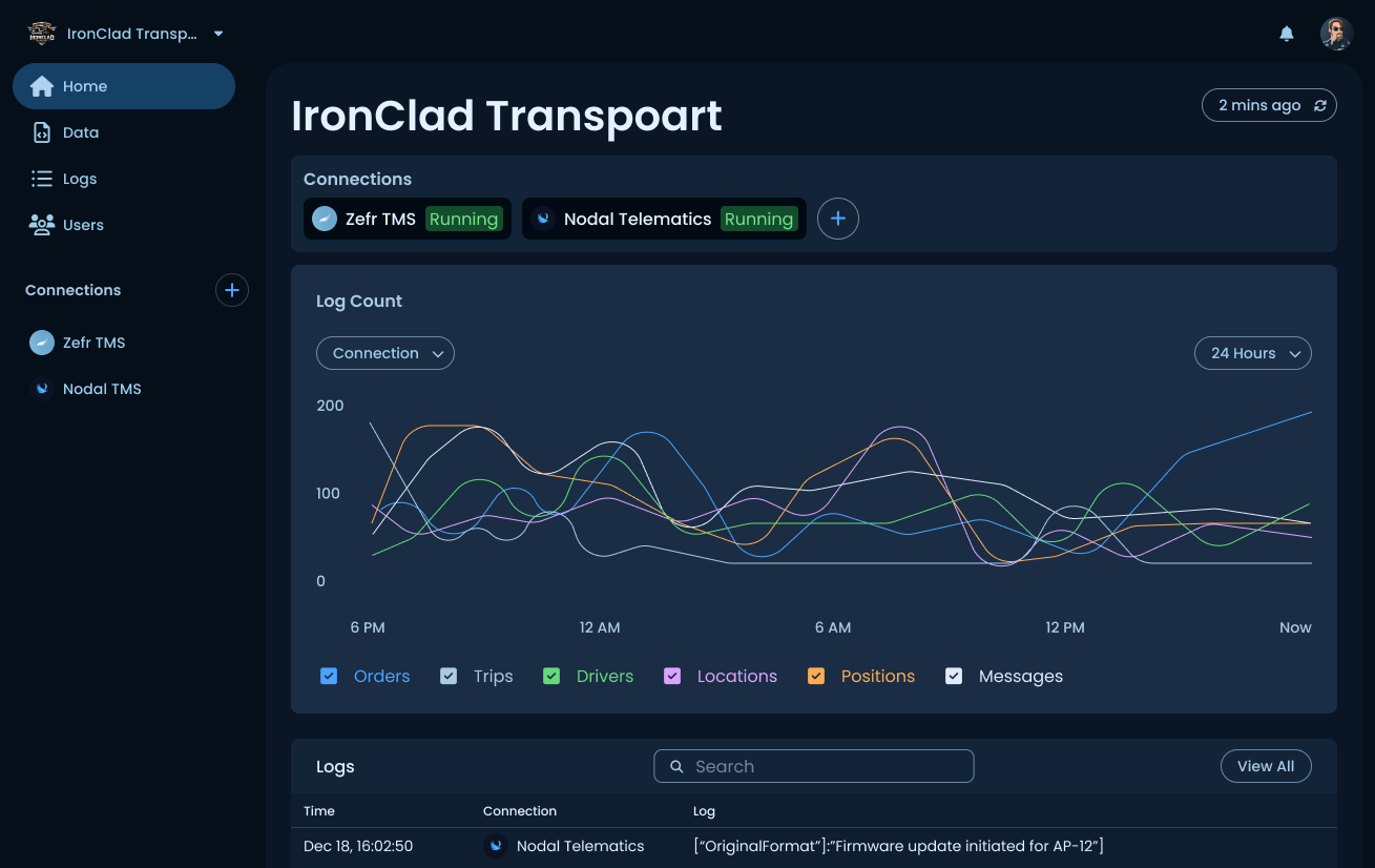
Home
The dashboard for the workspace shows active connections at the top with their current status, a log volume chart segmented by data type (Orders, Trips, Drivers, Locations, Positions, Messages) over a selectable time window, and a recent activity preview that links into the full Logs view. This is the screen a workspace owner lands on, designed to answer "Is everything running?" at a glance.
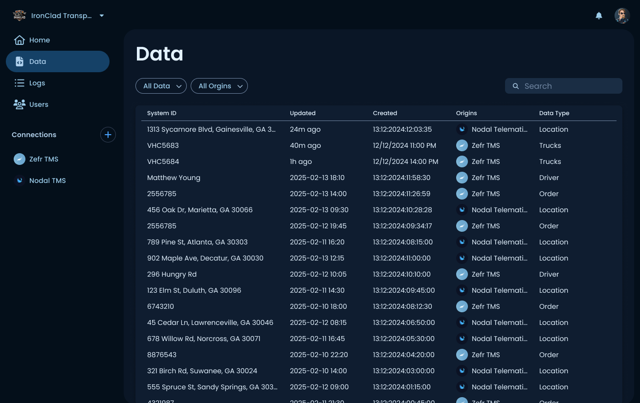
Data
The data page holds every record currently living on the platform, across all connections. Each row shows the System ID, when the record was last updated and originally created, which connection it came from, and the data type. Filterable by data type and origin. This is the inventory view, where a user goes to confirm whether a specific record made it onto the platform or to trace a record back to its source system.
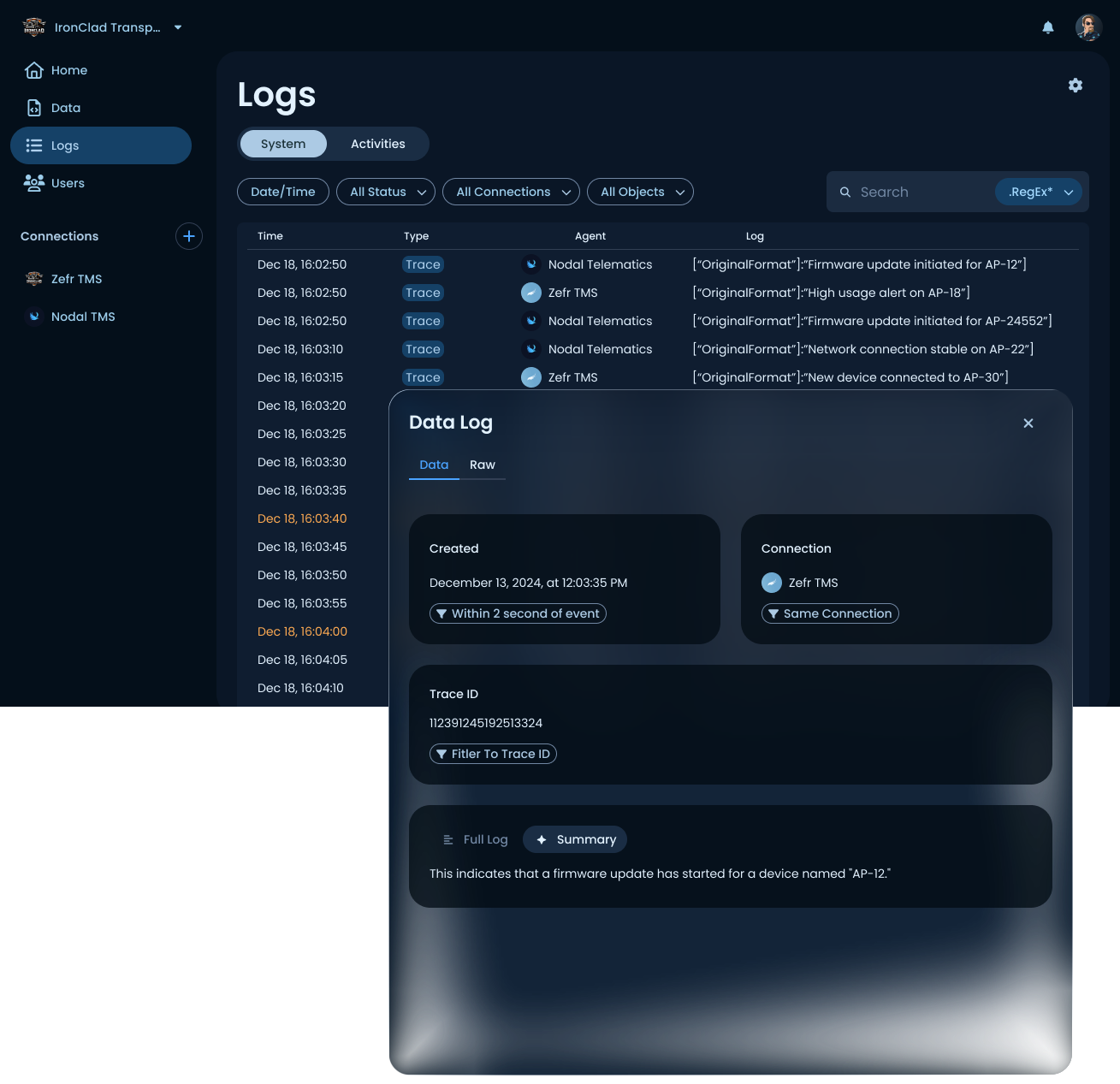
Logs
System and activity logs with structured detail panels. Each log entry can be opened to show its full context, including timestamp, source connection, trace ID, and the raw payload. Two features beyond a standard log viewer worth calling out: related-event filters (find all entries within N seconds of this event, or all entries on the same connection or trace ID), and an AI-generated natural-language summary that explains what the log entry actually means in plain English. The summary is one of the places Fuzion's AI-first identity shows up beyond the mapper.
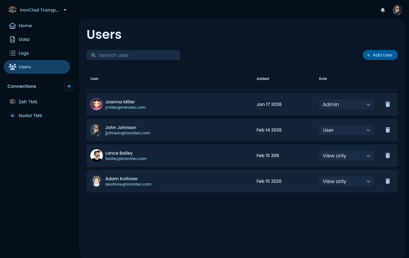
Users
Workspace member management. Each user has a role (Admin, User, or View only) that gates what they can do inside the workspace. Originally called "Permissions," then renamed after testing showed new users found "Users" much faster when looking to add someone. More on that in the Research section.
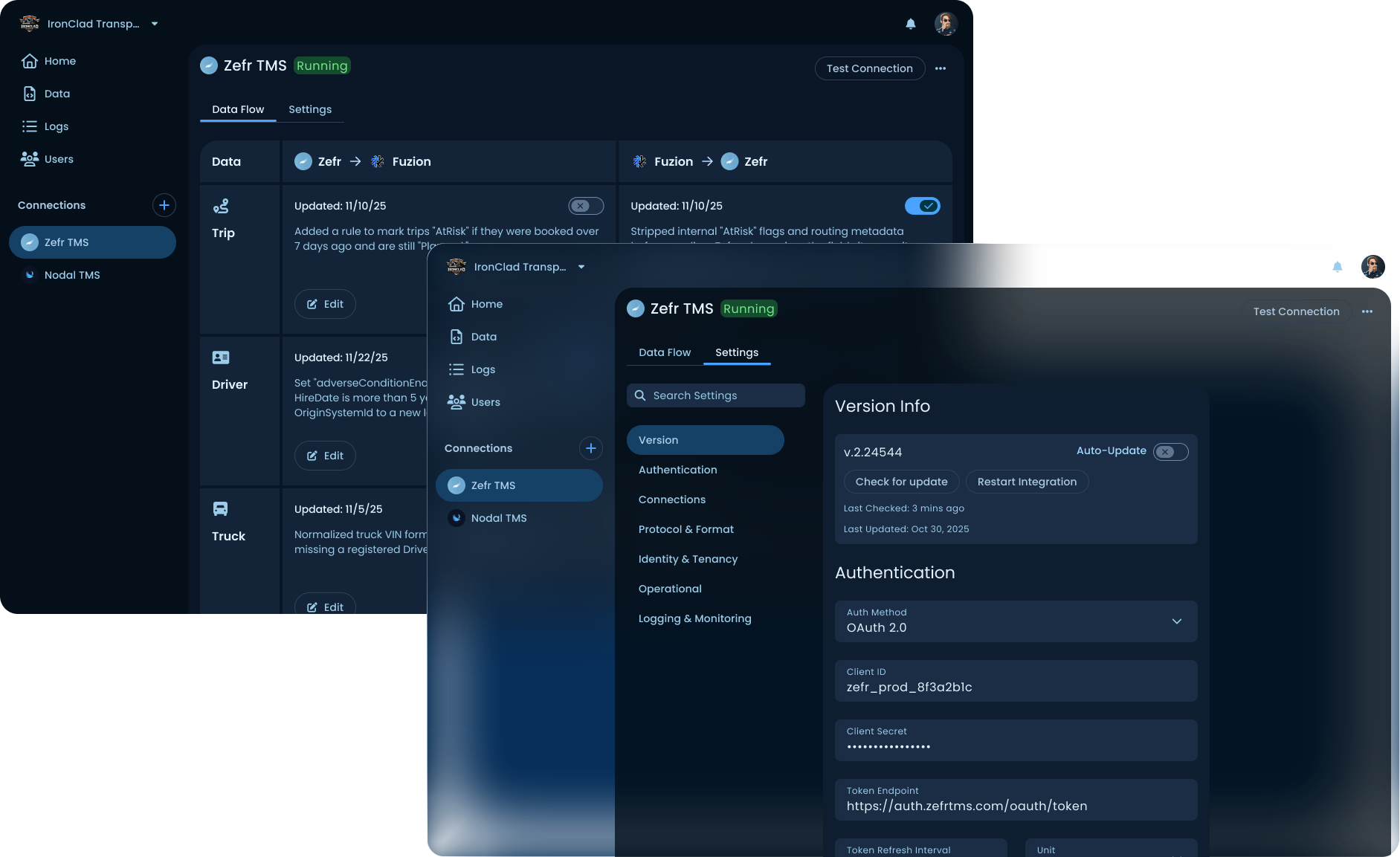
Connections
The heart of the product. Each connection has its own configuration, accessed through two tabs at the top of the connection screen: Data Flow (the per-data-type rules transforming data as it enters and leaves the platform) and Settings (auth, version info, protocol details, logging configuration). The connection screen is also where the AI mapper lives, one level deeper. Each data type with its own rules and direction.
Onboarding
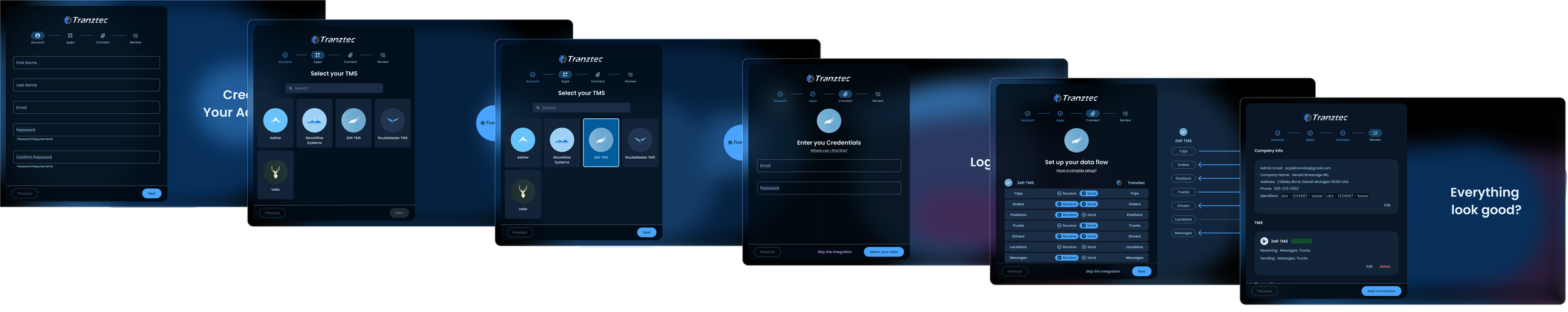
A five-step setup flow for first-run users: create an account, pick the TMS from the supported list, enter credentials, configure data flow, and then review. The flow ends with an "Everything look good?" review screen that summarizes the entire integration the user just configured, with edit links back to any step. The data flow step is the most substantial part of onboarding (and went through three rounds of iteration to land on the labeled toggle pattern shown).
Research
Thirty people across implementers, support staff, and non-technical roles inside Tranztec were interviewed. The interviews surfaced two patterns worth pulling out.
Implementers wanted speed, but they wanted more control. Every implementer I spoke to was excited about cutting integration time. However, every one of them, unprompted, asked some version of: "How will I know what the AI changed?" That question shaped the entire design of the mapper, field-level callouts, version history, Publish gate, and the AI/Code toggle. The implementer's instinct wasn't "let me hand the work to the AI." It was "let me direct the AI and verify its output." The product had to support that workflow, not bypass it.
Non-implementers could use the mapper. One of the project's stated goals was to make integrations approachable for non-experts. I ran usability tests with people from marketing, sales, and customer support, people who had never written a line of integration code. They could navigate the product, understand the mapping, and use the AI to make basic changes. They couldn't do the deep work an implementer does, but they could read the state of an integration and make simple modifications. That's a meaningful expansion of who can touch this product.
A/B testing the navigation
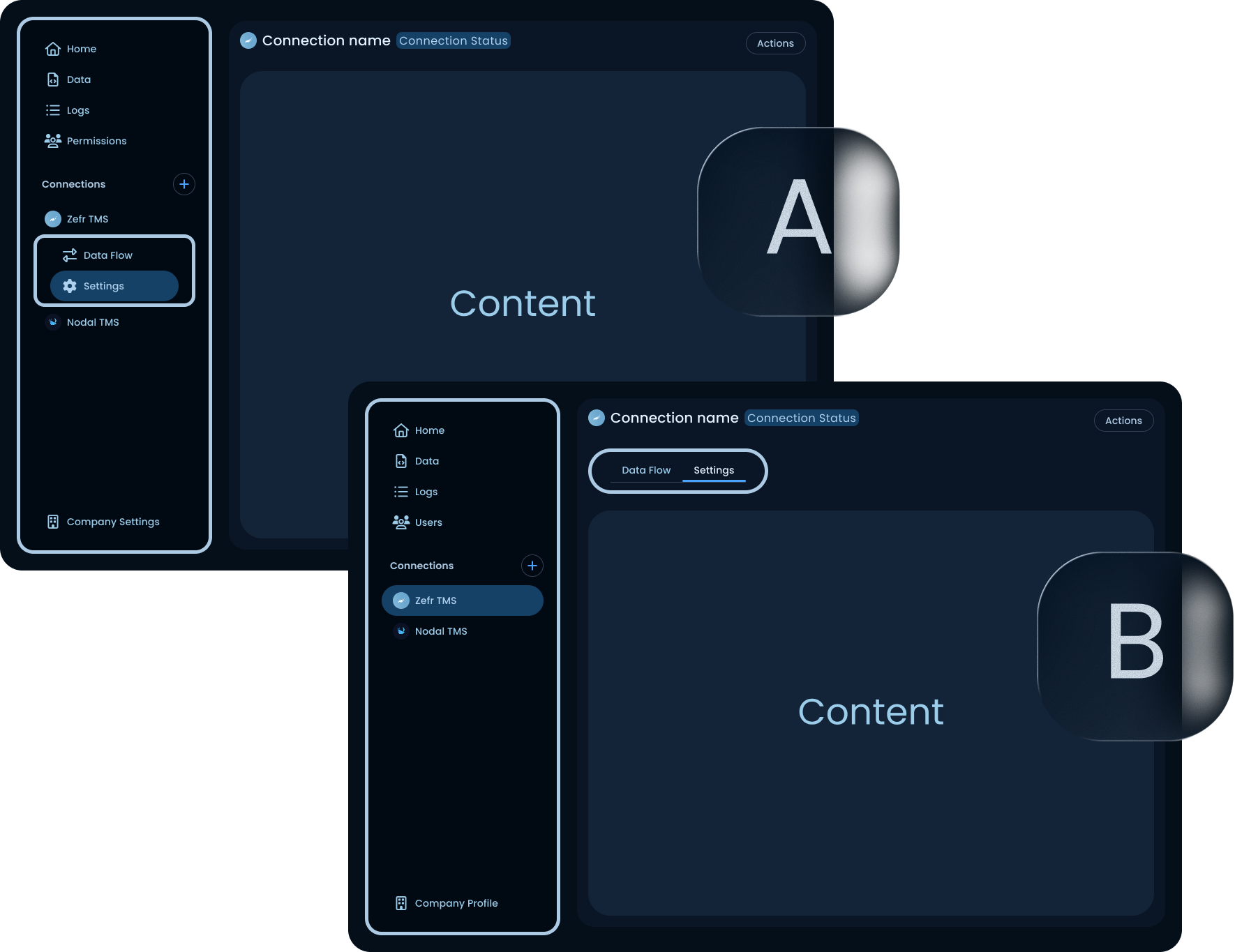
The results were split by user type. Experts/implementers who already had a mental model of the product, were slightly faster with version A. They knew the sidebar held everything, and the sub-items being visible from anywhere meant less clicking once you'd learned the pattern.
New users were a different story. In version A, new users often couldn't find the connection's internal nav at all. They'd click into a connection, see the connection's main screen, and then look for navigation inside that screen, not back in the sidebar. Some of them never found their way to Settings. They'd give up and ask someone for help, or just abandon the task.
The fix in version B: move the connection's internal navigation into the connection screen itself, as top tabs (Data Flow / Settings). The sidebar holds workspace-level navigation only. New users found the tabs immediately. Experts lost a tiny bit of speed but didn't get lost.
That tradeoff was easy to call. Experts can adapt; new users churn. Optimizing for the harder case is almost always the right move, especially in a product trying to expand who can use it.
Label naming. The team page was originally called "Permissions." When first-time users were asked to add a new person to the workspace, time-to-task was high. People scanned the nav, didn't see anything obvious, and often clicked into the wrong section before backtracking. I tested "Users" as an alternative label. With "Users," first-time users found the page faster and completed the task more directly.
"Permissions" describes what the page manages. "Users" describes what the page contains. For someone who hasn't built a mental model of the product, the noun beats the abstraction. That's a small finding, but it's the kind of finding that compounds across an interface. If every label requires the user to translate from product-internal concepts to plain English, the whole product feels harder to use.
Launch Death

Fuzion launched in late 2025. It tested well in internal usability sessions. It tested well in customer demos. Implementation times dropped from over a week to under a day for the integrations the team had built, exactly what the mandate asked for.
And then almost no one switched to it.
What I'd do next: lower the cost of trying it

The single biggest lever for Fuzion's adoption isn't a feature inside the product. It's a path into the product from where customers already are.
Right now, switching to Fuzion is a one-way door. A customer with a hundred working connections on the legacy product has to rebuild every one of them by hand to try the new system, and there's no easy way back if it doesn't work out. That's not a sign-up decision. It's a bet-the-business decision, and customers, reasonably, aren't taking it.
The fix is transition tooling. Two pieces in particular:
Import from the legacy product. Most of the structural information in a legacy connection (which data types flow which way, what fields map to what) could in principle be read out of the existing configuration and translated into a Fuzion connection automatically. The AI mapper could even handle the gaps. The customer wouldn't be rebuilding from scratch; they'd be reviewing and refining an AI-generated starting point. That cuts the migration cost from weeks of work to hours of review.
Export back to the legacy product, or at least parity reads. If a customer tries Fuzion and decides it isn't for them, they need a way out that doesn't strand their connections. Even a basic export that lets them recreate their setup on the legacy product would change the psychology of trying Fuzion. The decision becomes "let's pilot this for a quarter" instead of "let's commit our entire integration layer to a new platform indefinitely." Low-commitment experiments are how new tools win.
Neither of these is a design problem in isolation. Both require engineering investment that wasn't on the original roadmap, partly because they weren't part of the original problem statement. The mandate was cut implementation time. We did that. The mandate didn't say make it safe to try, and that turned out to be the question that mattered more.
This is the senior-level lesson I took from the project, and the thing I'd push for from week one if I were scoping a project like this again. Switching cost and pilot risk are not afterthoughts. For a product replacing an existing one, they're the primary constraint on adoption, and they need their own research track parallel to usability. Usability tells you whether someone can use the product. Switching cost tells you whether they will.